


Today we’d like to introduce you to Mark Simonson.
Hi Mark, we appreciate you taking the time to share your story with us today. Where does your story begin?
After studying art, design, and illustration in college in the mid-1970s, I worked as a graphic designer and art director. In the early days, I worked at a couple of small advertising art studios in Minneapolis for clients such as Pillsbury and 3M. I wasn’t crazy about the advertising world, so I switched publication design and art direction, working at Metropolis (a weekly newspaper in Minneapolis), TWA Ambassador (an inflight magazine), and Minnesota Monthly (Minnesota Public Radio’s member magazine). At MPR, my time was split between the magazine and being an in-house designer for the network, which included working on projects for A Prairie Home Companion and, eventually, a mail-order catalog (Wireless) that helped raise money for MPR. I left MPR in 1985 to pursue a career as a freelance graphic designer, just as desktop publishing was taking off.
Back in college, I got interested in designing typefaces because of a lettering project in which we were to create a font. The idea of becoming a type designer was planted in my brain. While doing graphic design and art direction at my day job, I always dreamed up ideas for typefaces. I submitted one to ITC (International Typeface Corporation) in 1978. Not surprisingly, it was rejected. It made me realize how little I knew about type design. The experience made me get more serious and learn more about the craft before trying again.
Meanwhile, in 1984, the Macintosh computer debuted. A year later, PostScript, the Apple LaserWriter, and the Mac launched the desktop publishing revolution. It soon became possible to design PostScript fonts on a Mac with a Fontographer app. In the early nineties, I got my first fonts published through FontHaus. By then, because we were expecting a child and my freelance business was not doing well, I took a job with Rivertown Trading Company, a sister company to MPR, where I did product and package design. Royalties from fonts were yet to be a significant part of my income, even though one of them (Felt Tip Roman) was a bestseller in 1996.
In 2000, I quit RTC to freelance again, launching Mark Simonson Studio. As part of my new business, I started selling fonts on the web through several websites, including MyFonts.com. Pretty soon, web sales surpassed the royalties I was getting from FontHaus for my earlier releases. Around this time, my wife was a contestant on Who Wants to Be a Millionaire, winning $500,000. This windfall enabled me to take six months off from my client work to focus on making three new font families. From then on, my font income grew.
In 2005, I released what became my most popular font family, Proxima Nova. By the end of the year, I was making enough to quit doing freelance design work and focus exclusively on type design, which I’ve been doing ever since. Proxima Nova has become one of the most popular commercial fonts.
Alright, let’s dig a little deeper into the story – has it been an easy path overall, and if not, what challenges have you had to overcome?
My path to becoming a successful type designer was long and circuitous. This is partly because I’m self-taught, learning most of what I know about making fonts from reading books and practice. This led to many false starts and mistakes along the way—designing and producing fonts and selling and marketing fonts.
My first distributor in the nineties, FontHaus, included a clause in their distribution agreement that allowed them to sublicense my fonts through a third-party distributor. This meant that my royalty was a percentage of a percentage. I didn’t understand what this meant when I signed the agreement.
I also discovered that the popularity of a font has little to do with the amount of time you spend on it, and you don’t know what will sell. That led me to be more careful about which designs to spend my time on and release many different stuff. Occasionally, one of them catches on, making up for the duds.
When I got interested in type design in college, I didn’t know how to get into it. There weren’t any courses you could take—no obvious career path. As a result, it took almost 30 years before I was doing it full-time. On the other hand, having spent several decades using type, I had a good idea of what kinds of fonts might appeal to designers.
Thanks – so, what else should our readers know about your work and what you’re currently focused on?
I am a type designer and font developer. I’ve created and released almost 400 fonts since the mid-1990s. My most popular type family is Proxima Nova, comprised of 80 individual fonts, each containing nearly 1500 characters, including support for Greek and Cyrillic. There will soon be Arabic, Hangul, Devanagari, Hebrew, and Thai versions. The range of typefaces I’ve designed is eclectic, from plain text faces to flamboyant scripts and “retro” styles, often based on vintage lettering. Coquette is one of my favorites, a display typeface that seemed to bubble up in my brain fully formed. It’s a hybrid of sans serif and upright script. It’s not based on anything specific, but undoubtedly, it came out of all the type and lettering I grew up seeing. I’m unusual because I’ve mostly worked independently, making fonts, rarely collaborating, and seldom working for clients. I mainly design typefaces I would want to use if they existed. So that’s where I tend to look for new ideas—things I haven’t seen anyone do yet that I would like to see as fonts.
Risk-taking is a topic that people have widely differing views on – we’d love to hear your thoughts.
Web fonts were a significant risk. In 2009, Apple’s Safari web browser allowed fonts to be used as resources on a web page, just like an image file, and Firefox and Chrome soon followed. Before 2009, web designers were limited to the fonts people already had on their computers—mainly Georgia, Verdana, Times New Roman, Helvetica, and Arial. Now, they could use practically any font, including commercial ones. People in the font business were understandably alarmed by this. There was no business or licensing model for using fonts on the web. Lots of ideas were proposed. No one knew if any of it would succeed. It could ruin the font industry. During this time, I was contacted by a startup called Typekit, which promised to “bring fonts to the web.” This would be a paid service with access to a library of commercial fonts. They wanted to include my fonts when they launched (mainly because of Proxima Nova, which was taking off by then).
I was impressed by the people involved who had previously created Google Analytics. Everything about web fonts felt risky then, but if anyone could make it work, it was these guys. In a year, I would either be thrilled or do some other kind of work (which would be true even if I didn’t sign up with them). So I went for it. It was a lucky decision and made Proxima Nova even more popular than it was—not only for web use but everywhere else. It turned out to be one of the best business decisions of my life.
Contact Info:
- Website: https://www.marksimonson.com
- Instagram: @marksimonson
- Linkedin: https://www.linkedin.com/in/marksimonson/
- Twitter: @marksimonson
- Youtube: https://www.youtube.com/@marksimonson74
- Other: https://www.marksimonson.art
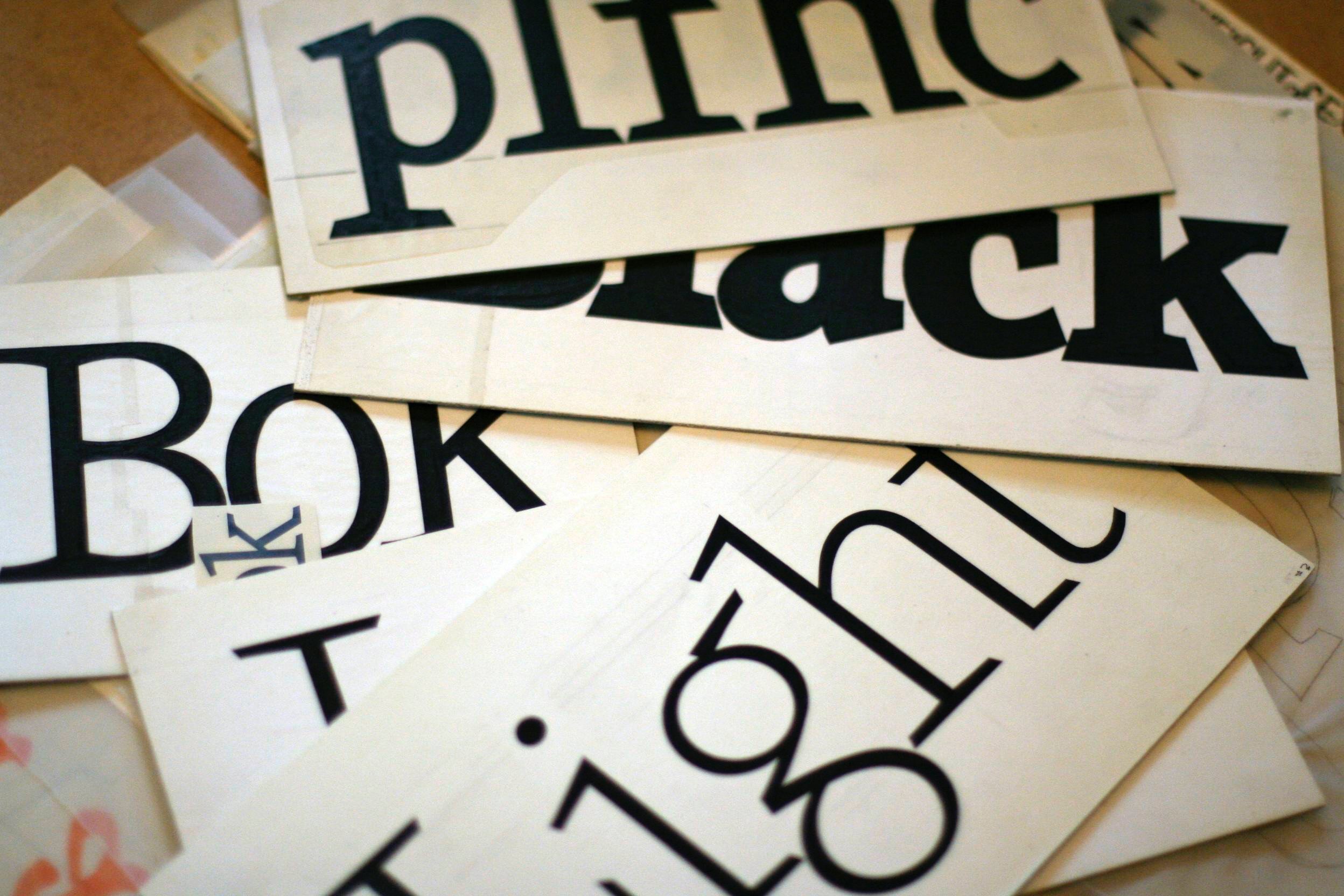

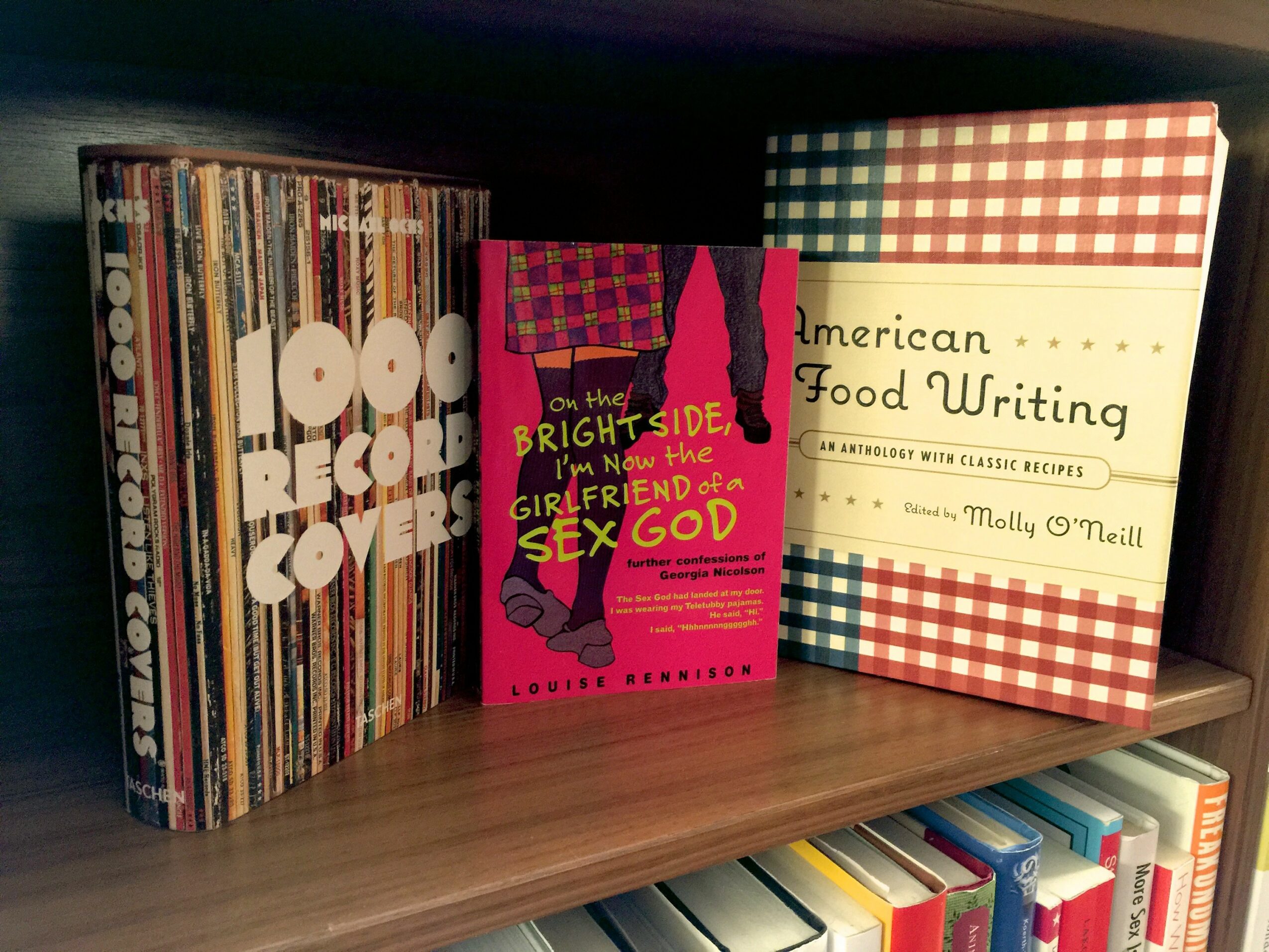

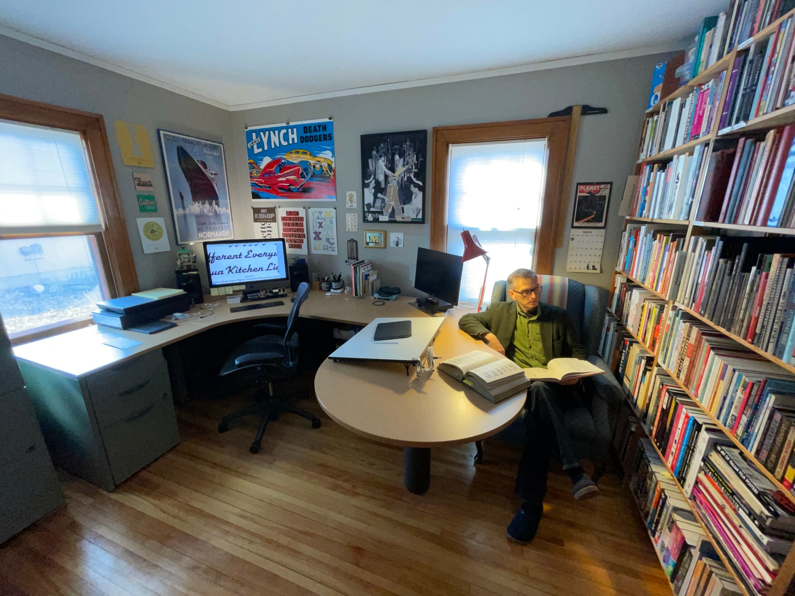
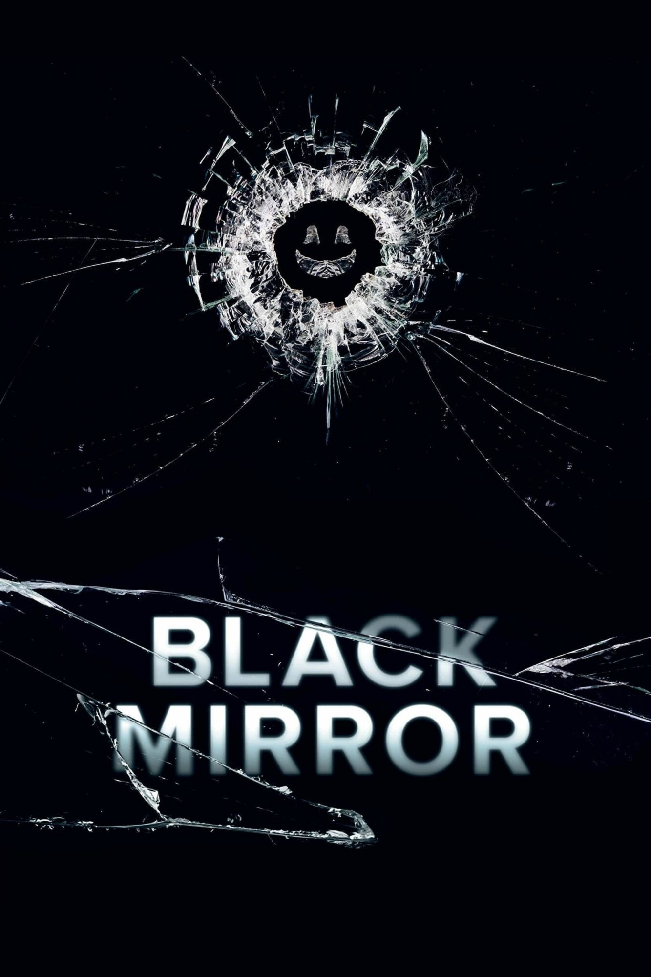
Image Credits
All photos @ Mark Simonson, except for the Black Mirror poster (example of Proxima Nova in use), which I found on the web.